Panel Tab
This tab covers the details of configuring the bars and panels that represent your unit frames. Note that Vuhdo allows you to individually configure up to 10 different panels, so when you are adjusting a panel make sure that the panel selected is the one you want to be making adjustments to. The name of the panel that you are making adjustments to will be displayed in the upper right corner of the Vuhdo Configuration pane. If you want all of your panels to have the same configuration then click the “Apply All” button when youre finished with a button section.
General
![Panels (General)]()
Quick: If you plan to heal 25-man raids or battlegrounds you may find that adjusting the max. Columns and max. Rows under Ordering allows you to fit your VuhDo panel(s) into your UI more easily. Otherwise leave these options alone.
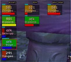
Advanced Set-up: In the Ordering section, you can configure the grouping of your panels, show/hide portions and align your panels. If you like to view your raid frames ordered by role (e.g., Main Tanks, DPS, Main Assists) and you’ve configured the Sort by… option to use Role then, Loose configuration can somewhat minimize the rearrangement of unitframes in situations where there is a lot of joining and leaving of the raid during combat. The Columns and Rows options allows you to set up a 1×25 panel or any other arrangement of your unit frames. You may want to return to this setting while in the Move! Tab as it will be easier to visualize your configuration effects when filled with units. Hide Empty option is there to hide any cells that are not yet filled in a group. You First will allow you to fix the position of your unit frame to always first within your group. Horizontal and bottom alignment tell vuhdo to populate the groups as players join the raid from the bottom up or horizontally first and then down (or up if you have both checked).
If you want to make an arrangement for a 5 man dungeon and want the ordering as blizzard keeps them now, ie. tank first, followed by healer and then dps, select Sort by… UnitID. If you’re determined to have tank in position one, order by max HP instead or make a MT window and show the tank there, and at the same time filter him out of the main group window under General (General) – Filter-5 man MT. The Anchor point tells Vuhdo which way to have the panel grow as players are added to it. The most natural is for it to grow to the right. Properties of the background Panel for the raidframes are also adjusted here so that you do not need to generate a separate background frame/border via kgpanels. I do not use this frame at all so I set both as you see in this image. Like for all the texture options, vuhdo does have sharedmedia support so if you want to swap out the border with something custom, this is where you’d do it.
Sizing
![Panels (Sizing)]()
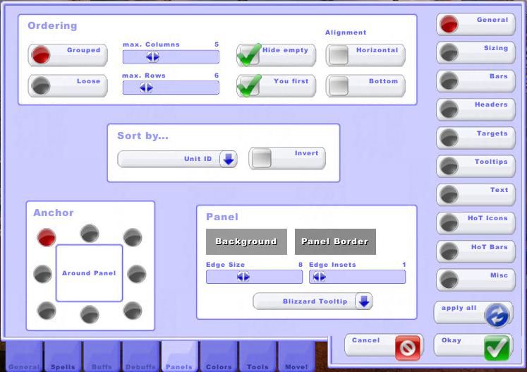
Quick: Adjust the height and width of your unit frames, the rest of the options will probably be sufficient as they are.
Advanced Set-up: Here you can adjust size of all the unit frames, as well as padding and spacing between the unit frames. The spacing between the unit frames and the border of the background panel is adjusted using the X,Y-Gap sliders.
Bars
![Panels Bars]()
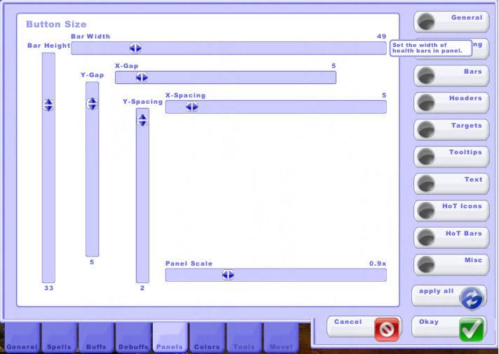
Quick: If you want to show mana or energy bars adjust the Mana Bar Height under Custom settings. Under Bar Color select Class Col. to show your health bars according to the player’s class.
Advanced Set-up: The bars panel is where you can choose a texture for the unit frames under Bar Texture. Sharedmedia is supported. I like to use one that looks a little like my old Grid frames did, but there are a lot of choices so you should find something you like. These custom settings for mana bar height and panel health bar textures are in the panel settings in case you want to have a different per panel settings for these. These settings will override the ones under General Indicator – Health Bar, Mana Bar and Side Bar on a per panel basis and take priority. Dmg Flash under Misc is there if you want to have the bars under a certain hp percentage flash so as to give you an extra warning that they need to be healed. Percent of health it triggers at can be adjusted under sensitivity. Bar Color provides options to change the color of the health bars.
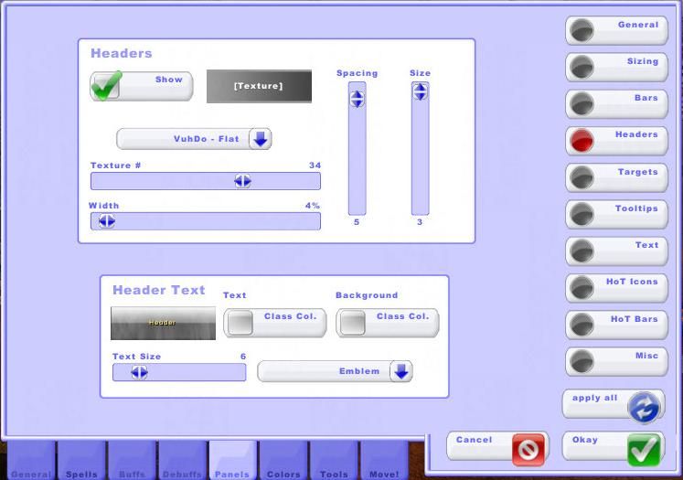
Headers
![Panels (Headers)]()
Quick: Leave these options alone.
Advanced Set-up: This is where you can control what the headers look like. Headers in most cases are not really needed if you sort your frames by Unit ID in the General button panel. I tend to move my panels around my UI alot for various activities so I keep the headers as a “drag” point. However, I minimize thier appearance as shown in the screenshot. The options are pretty similar to the sizing options so follow the same principles.
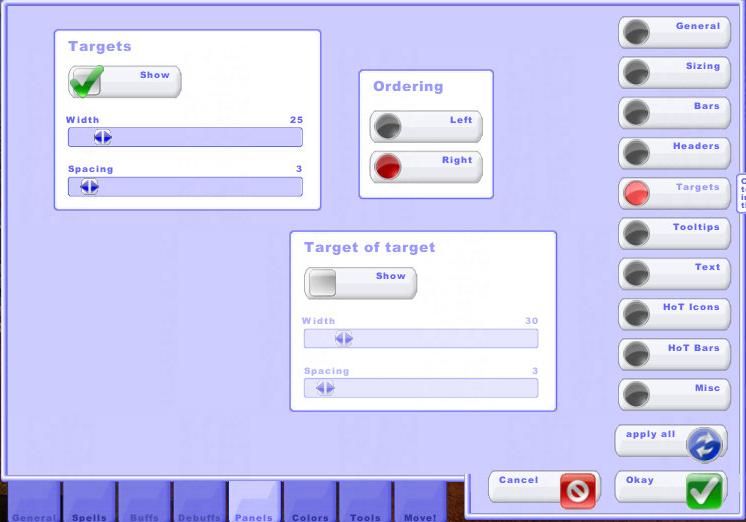
Targets
![Panels (Targets)]()
Quick: Enable the Show Targets if you want to show player targets in your VuhDo panels.
Advanced Set-up: In this panel you can choose to show the targets and Target of target of each player. This is useful when you’re setting up the main tanks window and want to show tank targets and targets of target. This is also very useful when you want to squeeze in a bit of dps as a healer (e.g., Paladin Judgements and Atonement Priests). Just set up the spells you need (e.g., Judgement and Smite) in the Spells (Hostile) panel. Ordering just indicates on which side of your player unit frames the targets and ToT are shown.
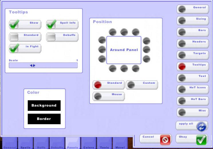
Tooltips
![Panels (Tooltips)]()
Quick: Enable the Show and Spell Info under the Tooltips section so that you can see your keybound spells. Leave the rest of the options as they are shown.
Advanced Set-up: Under the Tooltips section you can choose to show the Vuhdo tool tip and then select the Position. Background, border color/opacity and size of the tooltip can be adjusted here. Keep in mind, like everything in the panel menu, this is a per panel setting. Under the Tooltipsyou have the option to show spell info and display your spell-mouse assignements as a reminder, you should also leave In Fight on. If you want the option to show mini debuff tooltip while mousing over debuffs on your hpbars, check Debuff (it is a separate tooltip from the one referenced by other options in this panel). This can be distracting if your debuffs are in the middle of your hpbar as the tooltip may partially obscure the bar and its elements, and it may interfere with your click-casting assignments. Under Position you can indicate where you want the tool tip displayed, right at the mouse tip, in the standard position or a custom one (anywhere on the screen or even flush with the panel).
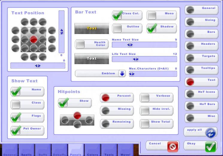
Text
![Panels (Text)]()
Quick: Select a Text Position, I recommend center of the unit frame, and enable the Show Hitpoints option.
Advanced Set-up: The options in this panel adjust the positioning, color, size, and font type of the text on the unit frames. Under Bar Text I like to have my names class colored as my health bars are solid. Since vuhdo supports sharedmedia, you can in addition use fancy fonts here to match your UI. If you decide to show both hp text and name text all in one continuous line (left and right positions for hp), you cannot have them different sizes. Otherwise, size adjustment for hp text and for name text is separate (up and down positions). There are plans to make this part of the bouquets, which would open up its display options greatly, but there is no ETA on when that will be implemented. As you can see in the image under Hitpoints you can determine where and how you display the hp on your unit frames. Check Show and choose the type of health number display. I personally like to show them as a percentage above the player name. Also, tags such as dc, afk, dead and so on and their positioning with respect to player name is affected by the positioning of the hit points display (the 4 selectable positions). Even if you choose to not show hit points at all, this positioning will still hold for these tags so careful when you choose it.
Hot Icons
![Panels (Hot Icons)]()
Quick: Under Own HoTs select a HoT position configuration, I prefer the corners of the unit frame from my grid days. Under HoT Order select your spells according to which position location you want to display them on. I have an example set-up for my priest in the image.
Advanced Set-up: This is an important panel as this is where you set up all your hots. The first options under Own HoTs are for adjusting the positioning of the hots. The first one positions them in a straight line and you can anchor that line anywhere around the unit frame. If you anchor it top left, they will start top left and expand horizontally to the right and then down. The second two of them involve positioning hots in corners/borders of the unit frame. The size adjuster on the right will change the size of both buffs and debuffs. Everything in this section is panel specific, so if you don’t want to show information for the pets panel, you can set the size of hots to 0 and get rid of the hots there. For the other 2 position options you can click on More and you get sizing panel for each of the hots. Options for whether you show hots as little colored squares or icons are done here also. Check glossy or flat for colored squares and Icons for actual spell icons. If you’re showing little color boxes, you may want the timer off entirely which you can do under the next Tab covered in part 5 of this guide. You also adjust colors for the different hot icon positions there. For stacks, you have 3 choices. You can turn them off entirely, show them by number of stacks, or by triangles (triangles in a square, each quarter means one stack). I show them as a number of stacks (again from my grid days).
Under the Text Options section the timer and stack text can be adjusted. You can also choose a different font or position of these numbers for improved readability by clicking on Timer or Stacks. There are also further HoT timer font properties under some of the options in the next guide if you want more flexibility. If you are a priest (or pally but less useful for them), and want to know how much of your shield has been absorbed and how much is remaining, check shield status in the Shields section. This will draw a circle on top of the shield icon, that will approximate the value of shield left on the target. The numbers are rounded to quarters (25%, 50%, 75%, 100%). Since shields now stack as heals are added, the feature Pump Aegis has been added to track the internal cap for the Divine Aegis spell. As a result you watch the value for this bubble increase over time if the crit heals or PoH reapplies it and you can more accurately estimate its current value.
In the HoT Order section you can select what you want to show at each HoT position be it ebuffs, buffs, clustering, threat information, aggro, range, etc. Select the HoT from the dropdown menu (or just type it in spelled exactly as in the spellbook) and select select whether you want to see only your own hots or the ones from other healers as well. If there are more than one disc priest in a run it may be important to show shield and Weakened sould debuff for both shields. Finally, cluster finder information and AoE Advice can be shown here so you can identify which targets are best to cast your Wild Growth or Chain Heal on.
Hot Bars
![Panels (Hot Bars)]()
Quick: Leave these options alone.
Advanced Set-up: This, like hot icons, is another section interfaced with the bouquets and anything you’re showing under that section you can show here. Keep in mind though that hot bars are linked to timers so you want to use anything on a timer here and not a constant aura/effect (you should really use boquets for those). Choose the desired positioning of hot bars that will best avoid your other elements within the unit frame. Like the hot icons, these bars will scale with the unit frame size but you can use the panel? slider to keep them the same size regardless of the unit frame size.
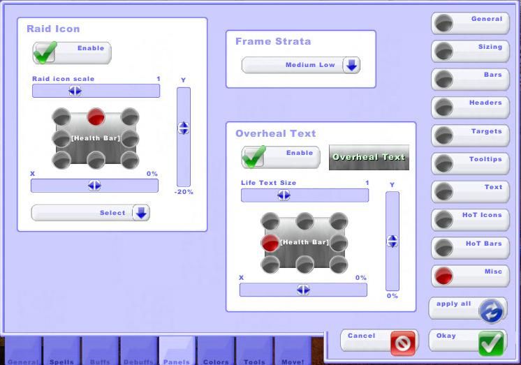
Misc
![Panels (Misc)]()
Quick: Leave these options alone.
Advanced Set-up: This is where you adjust properties of Raid Icon and Overheal text positioning and sizing. In the Frame Strata you have an option to adjust the frame strata, which is the positioning of your frames with respect to other elements of the UI. If your VuhDo elements are blocked by or blocking other parts of your UI, adjust this slider to bring the VuhDo panel forward or back.
![]()
![]()
 The next in sequence for the new instances is probably the longest of the three due to the amount of trash that needs to be cleared, so settle in folks. I’ll continue with the boss by boss rundown, with any notable trash mentioned, that you’ve come to expect. Again these instances represent content that is only relevant on heroic so the gear linked will be the heroic versions.